
About 2.0
From static and ineffective content to a data-backed rotating engine
What’s the project? A feature, similar to Instagram’s Notes, helps users quickly share availability or lightweight expression using a text + emoji format.
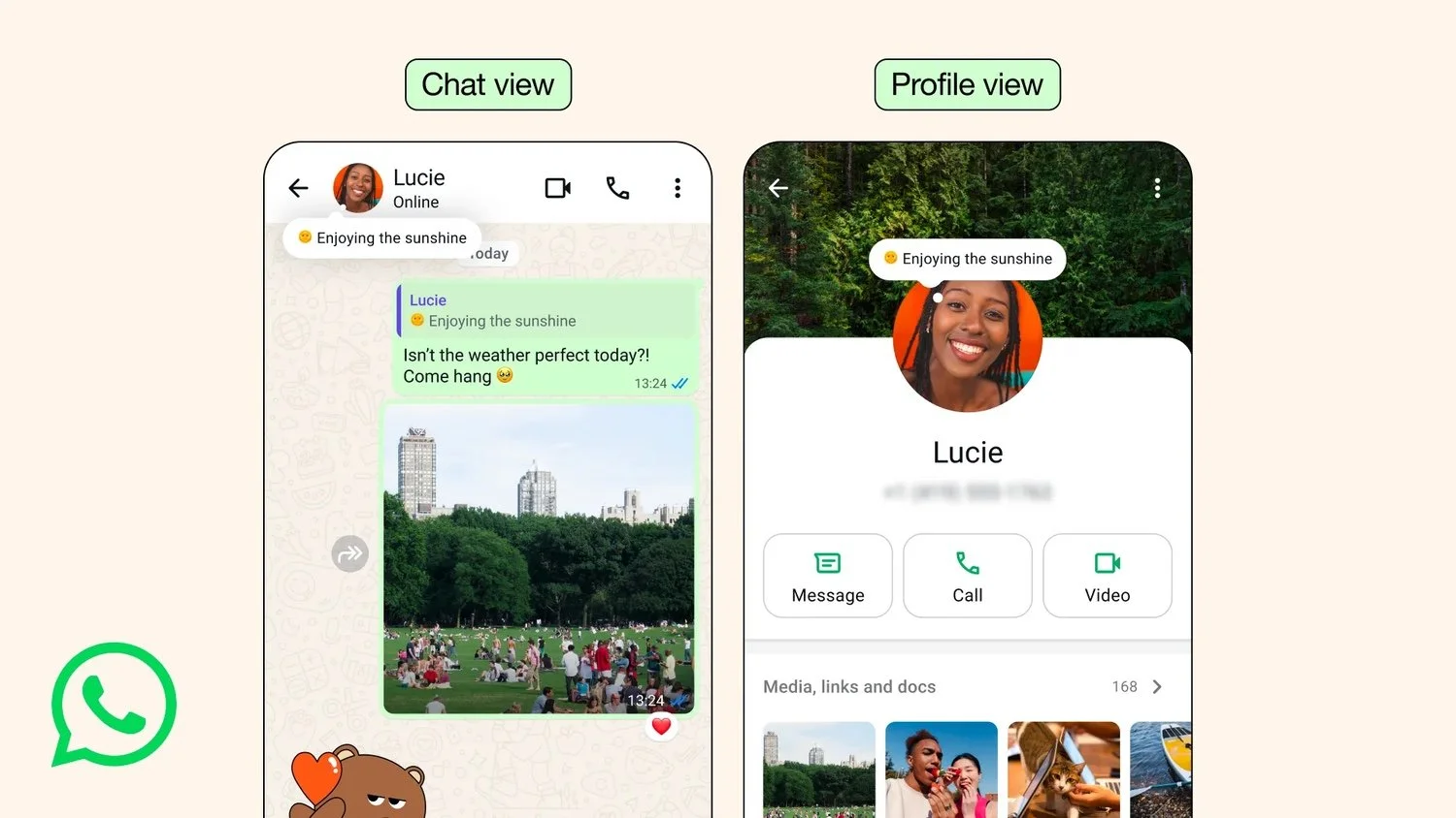
GTM campaign
Problem
Product problem:
The About feature was buried 2-3 taps deep in Settings, had no visibility where conversations actually happen and users didn’t understand the feature’s purpose.
Content problem:
Entry point text was impersonal and static. A long list of presets caused cognitive overload and had no alignment to main use cases.
TLDR:
Low awareness + adoption
Low feature comprehension
No content strategy to educate new users, re-engage existing ones, & keep the feature feeling in the moment
Solution + My Role
We introduced a lightweight emoji + text format with duration and surfaced About as a thought bubble in 1:1 chat.
Content: I created a rotating prompt engine for the entry point content & a universal preset list that spoke to primary use cases.
My Role:
Helped define user problem and design solutions
e2e content strategy + experimentation
Helped shape product & GTM positioning + naming
Collaborated on UXR planning
Established scalable logging
Impact
+.17% Sends per Daily Active User & .5% group send per DAU
Exceeded adoption goals by 45% and retention by 50%
100% positive user sentiment

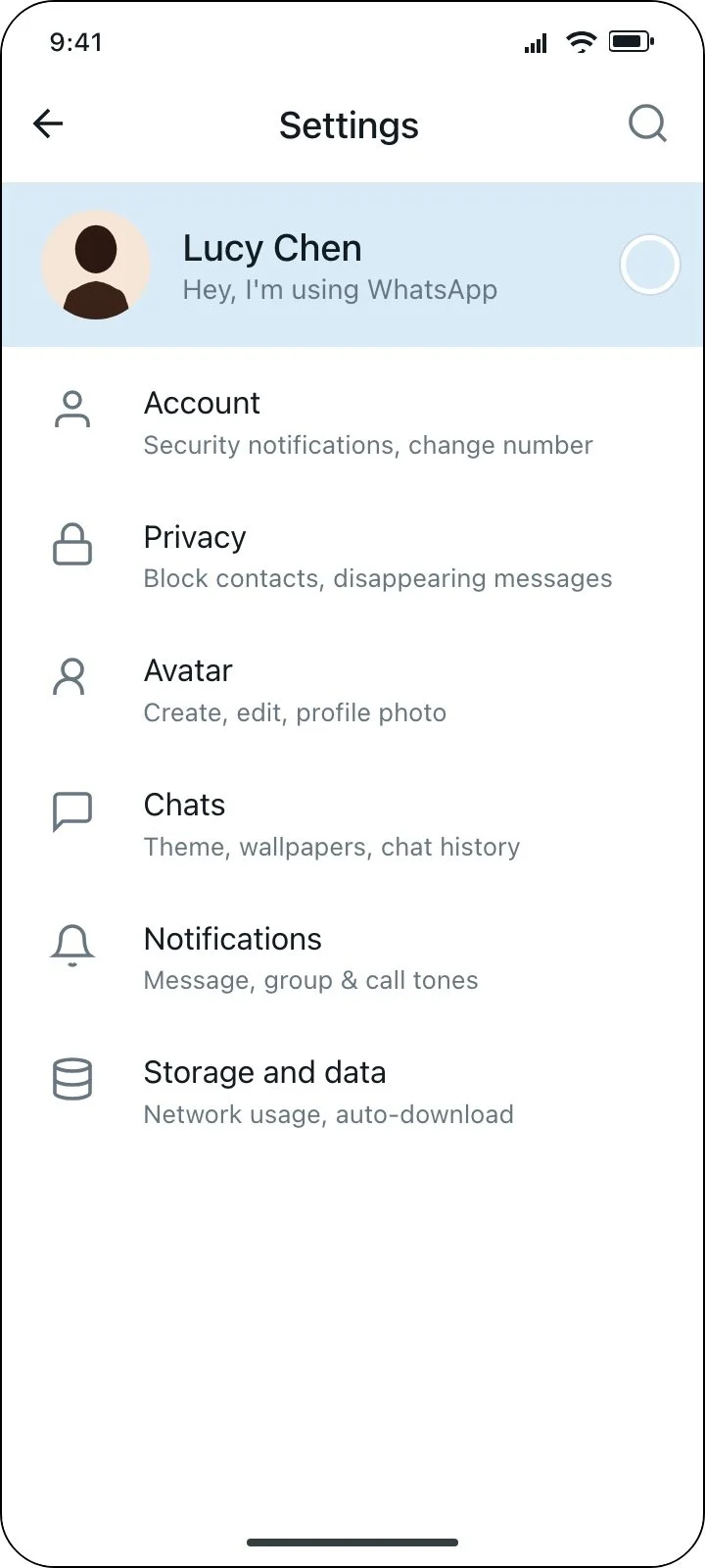
Before
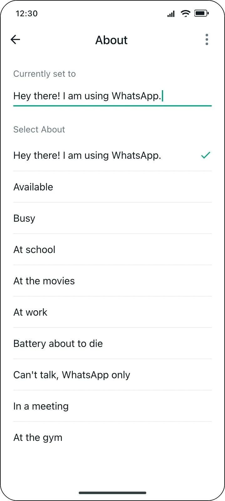
After
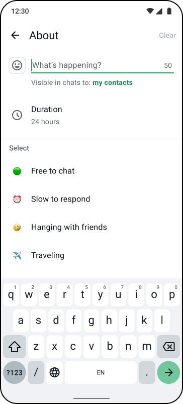
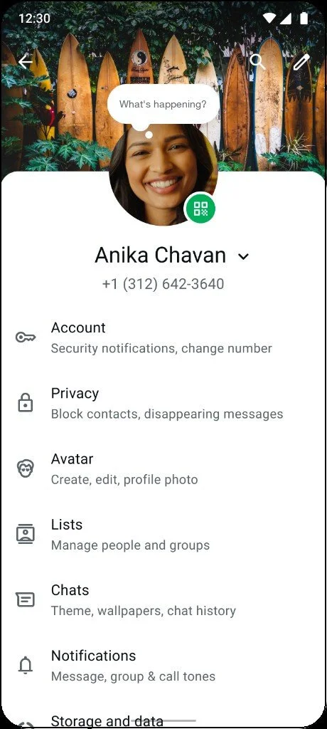
Constraints
UXR showed that users lacked feature comprehension: “I don’t know what this feature is for?”
Users felt insecure or unsure of what to post for their About.
The feature needed clear distinction from WhatsApp’s other feature, ‘Status,’ which is a visual, broadcast, creation-heavy tool.
Universal — reach 180+ countries which varied significantly on comfortability with ‘expression’
My goal
Content was a primary lever in the usage of this feature. It needed to meet:
User need: feature education, use case (availability-expression), easy to use
Business need: Feature adoption, make About an everyday posting tool, and ultimately drive conversation.
Voice, tone and language framework
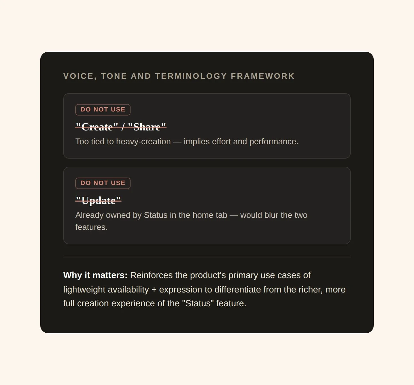
Always coming from a place of systems-thinking, I created and socialized a framework to ensure content upheld the feature’s primary function of ‘lightweight availability/expression’ and had clear distinction from WhatsApp’s other feature ‘Status,’ a richer, more full creation experience tool.
A principled approach to content strategy
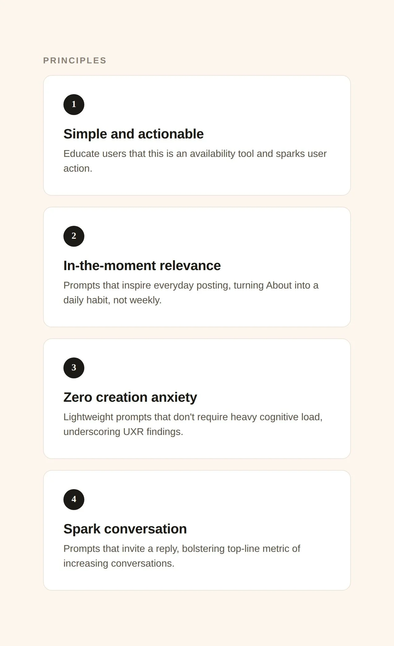
I crafted principles rooted in UXR to shape the content to meet user need and ladder to top-line product goals.
My content experimentation that turned the content from static and impersonal to dynamic and tailored
Why run an experiment & how I got buy in
Getting buy-in meant speaking each team's language. With engineering, I scoped the test small enough to read as low lift, not extra work.
With PM, I made the case that content was integral to reaching product goals of adoption and retention, and the only way to prove which direction moved those numbers was to test what actually resonated instead of assuming.
Goal
Build an adaptive content engine that creates a feeling of freshness, drive in-the-moment posting, reduce anxiety, and educate new users —all tied directly to moving top-line metrics:
Group Sends per DAU
Send Session @ 14 (retention)
I led XFN collaboration with DS and Eng to create a 4-arm country test experimenting with 4 thematic approaches. To induce freshness aligned with the strategy, a user would see a new prompt every time they opened the app.
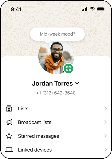
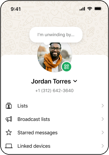
In-the-moment: DOW, Time of Day
Why?
The 2026 product strategy required shifting About from a weekly to a near-daily habit.
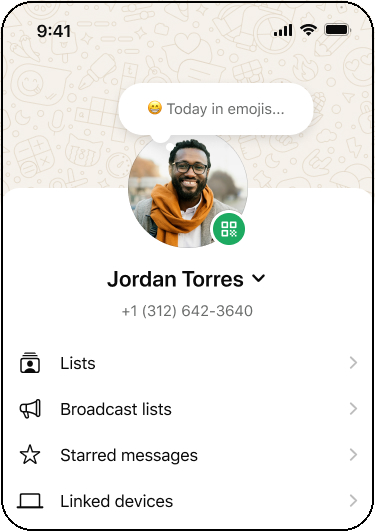
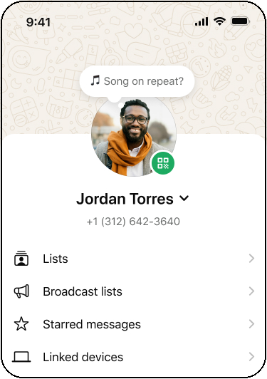
Mediums (emoji + music)
Why?
I pulled data from Instagram’s Notes previous experiments that showed emoji and music prompts drove creation wins.
User Journey
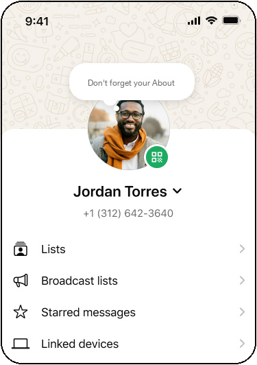
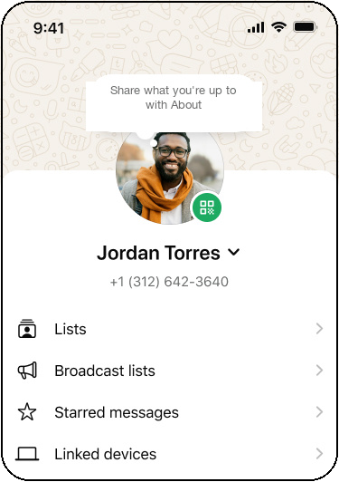
Why?
UXR showed new users experienced blank-canvas anxiety, while existing users needed freshness to re-engage.
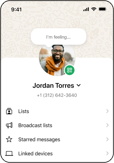
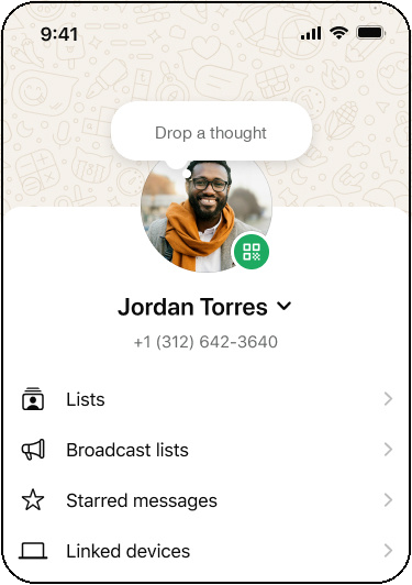
Expression
Why?
I wanted to validate a range of use cases to understand which was satisfying user need the most.
Results
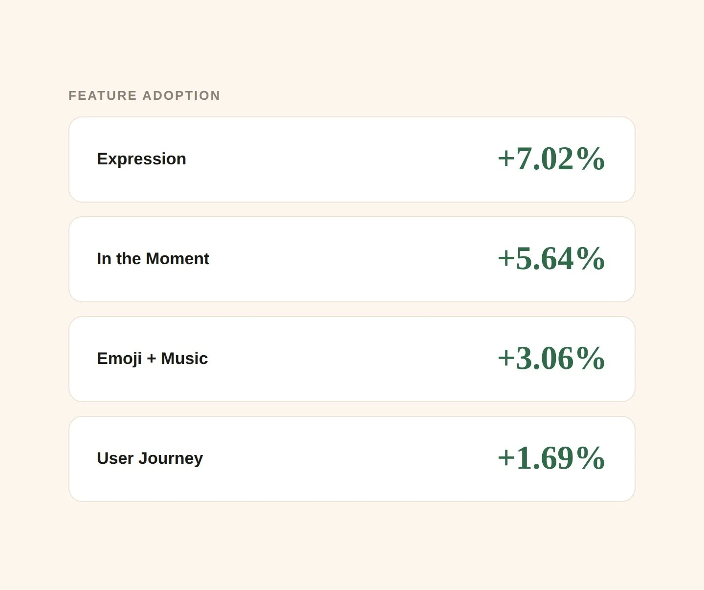
My choice to create a rotating content engine successfully drove feature adoption and message sends.
Interestingly, user-journey prompts did not perform well indicating less need to educate through content and more through design.
I chose the top performing prompts from expression, in-the-moment, and emoji/music that gave users a new prompt every time they opened the feature.
Using my content as a marketing lever
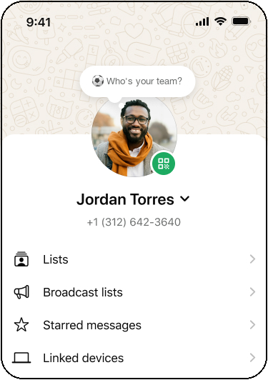
Because the strategy drove measurable lifts in adoption and retention, I partnered with PMM to extend it into app-wide marketing moments like World Cup 2026.
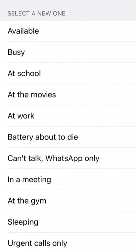
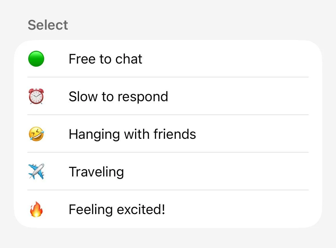
Presets
After
Before
A system, not a copy refresh
I treated presets as a system, not a copy pass. They had to reinforce what About is for while flexing across different use cases — from "I can't talk right now" to "I'm feeling something and want you to ask about it."
The tension I was solving for: How to keep one legible feature that still spans hard availability to lightweight expression, without reading as a grab-bag. The fix was a spectrum, not a list — every preset sits somewhere between "Free to chat" and "Traveling," so the range reads as one idea.
Universal by design: Situations and feelings that are globally recognizable, evergreen, and age-agnostic. Emoji choices informed by chat usage data.
Always invite conversation. Shifting from "Busy" → "Slow to respond." "Available" → "Free to chat" opens a door to conversation. "Feeling excited!" prompts "About what?" Every preset gives a contact a reason to reply.
Educate through example. For new users, presets are the onboarding. They model the right length, tone, and specificity — lowering blank-canvas anxiety while showing what "good" looks like.
Novelty kept it alive. Low-performers rotated out; seasonal presets rotated in — so the feature didn't go stale after week one.
Explorations - A methodical approach to finding the right range, tone and use cases that aligned with user need and product goals
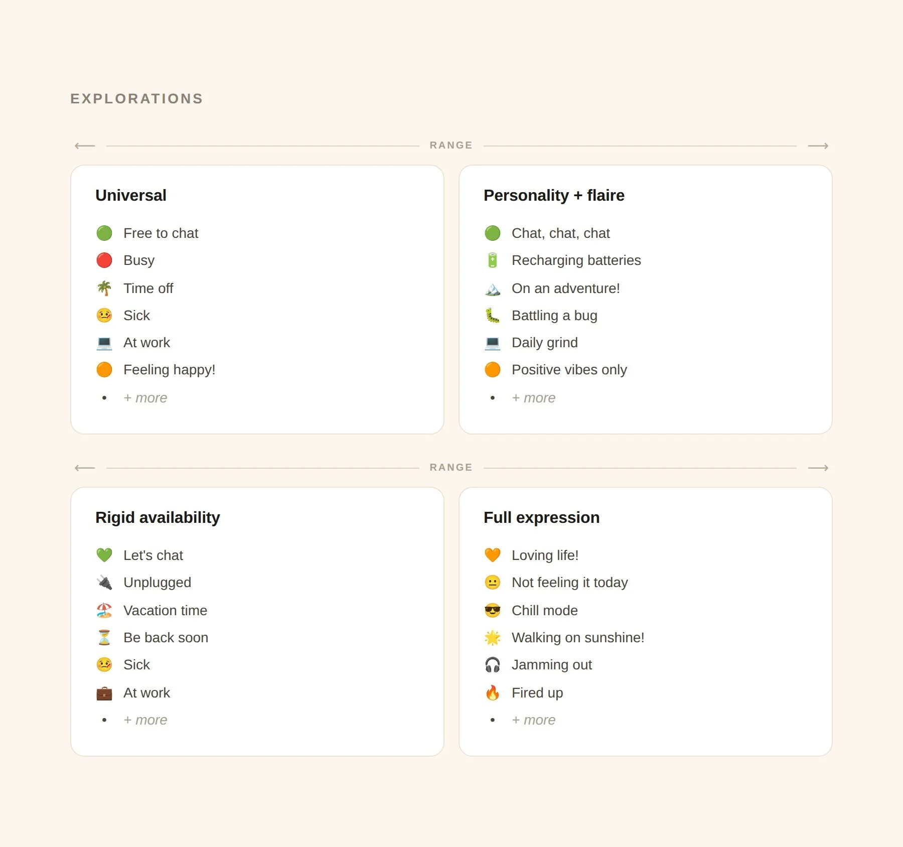
A key decision to cut the list in half
The initial preset list was long, exhaustive and did not align with our new product goals/primary user needs. I cut the list by half.
Why?
Users were already coming to About 2.0 with NO clear mental model of what the feature was, so presenting them with a wall of options would compound that confusion.
Posting anxiety was a core barrier to adoption, a long list risks the opposite of its intention — instead of helping users pick something, it paralyzes them.
Outcome:
Adoption of presets went up by 22% after cutting the list
UXR showed it helped with user education on how to use the feature
Implemented logging = improved optimization
Previous presets had NO logging. I changed this. I ensured logging was implemented with DS for us to understand the user-value of these and which ones were not resonating with users.